Incorporating ggplots and other
grid-based Bioconductor visualizations
Source: vignettes/guides/incorporating_ggplots.Rmd
incorporating_ggplots.RmdIn addition to its numerous built-in genomic functions,
plotgardener can size and place ggplots and
other grid-based visualizations within a
plotgardener layout. Rather than arranging these plots in a
relative manner, plotgardener can make and place these
plots in absolute sizes and locations. This makes it simple and
intuitive to make complex and combined
plotgardener,ggplot, and other
grid plot arrangements beyond a basic grid-style
layout.
ggplots
Let’s say we wanted to make a complex multi-panel ggplot
about COVID-19 data consisting of the following plots:
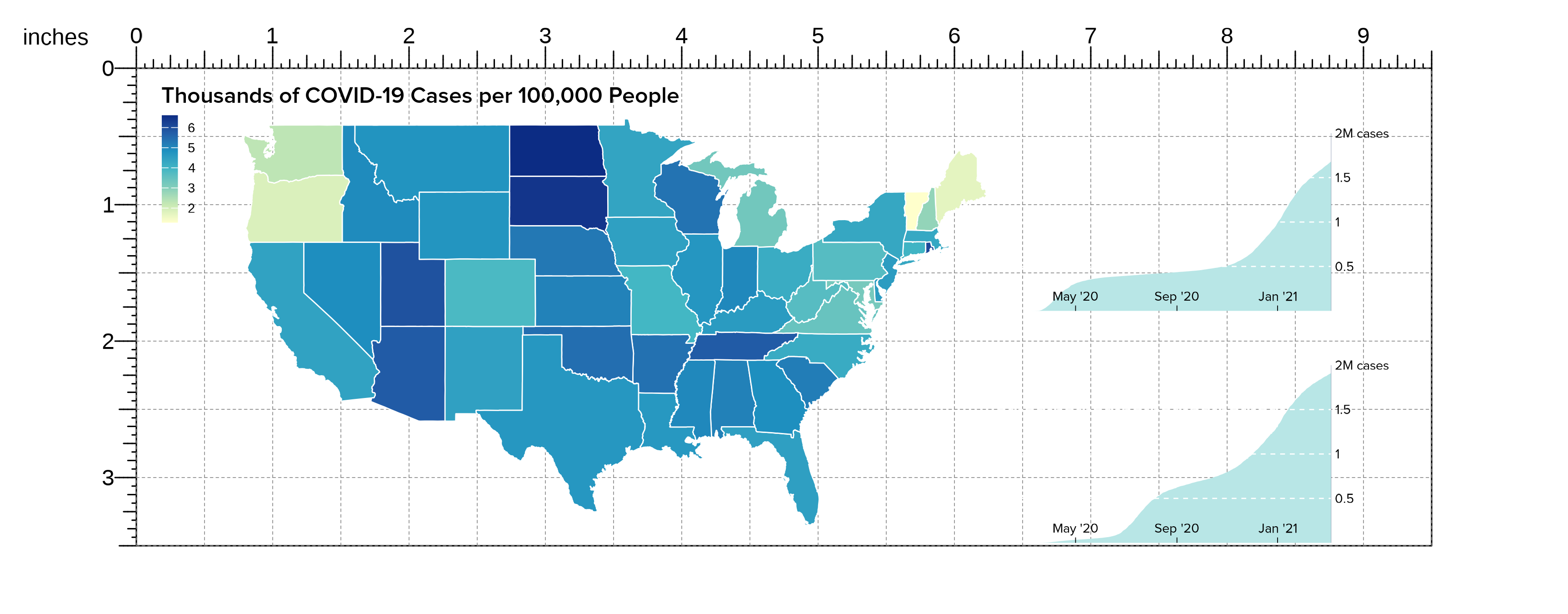
- A United States map depicting COVID-19 cases:
library(ggplot2)
library(scales)
data("COVID_USA_cases")

US_map <- ggplot(COVID_USA_cases, aes(long, lat, group = group)) +
    theme_void() +
    geom_polygon(aes(fill = cases_100K), color = "white", size = 0.3) +
    scale_fill_distiller(
        palette = "YlGnBu", direction = 1,
        labels = label_number(suffix = "", scale = 1e-3, accuracy = 1)
    ) +
    theme(
        legend.position = "left",
        legend.justification = c(0.5, 0.95),
        legend.title = element_blank(),
        legend.text = element_text(size = 7),
        legend.key.width = unit(0.3, "cm"),
        legend.key.height = unit(0.4, "cm"),
        plot.title = element_text(
            hjust = 0, vjust = -1,
            family = "ProximaNova", face = "bold",
            size = 12
        ),
        plot.title.position = "plot"
    ) +
    labs(title = "Thousands of COVID-19 Cases per 100,000 People") +
    coord_fixed(1.3)

print(US_map)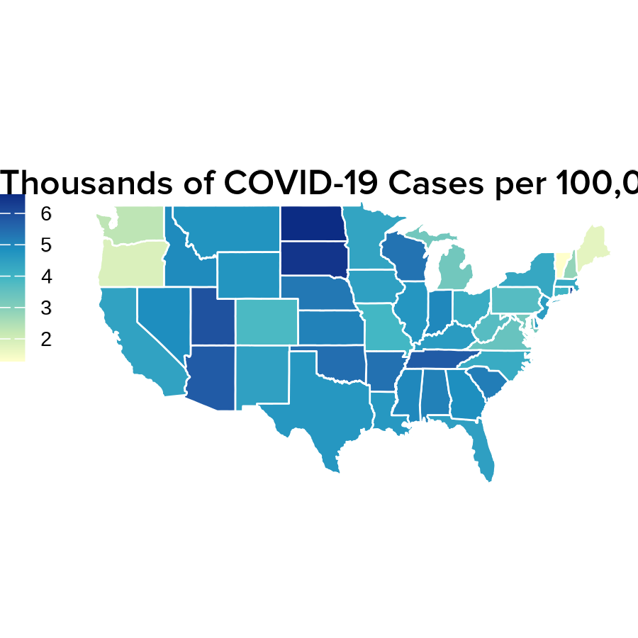
- Line plots showing the accumulation of COVID-19 cases over time:
data("COVID_NY_FL_tracking")

# Format y-labels
ylabels <- seq(0, 2000000, by = 500000) / 1e6
ylabels[c(3, 5)] <- round(ylabels[c(3, 5)], digits = 0)
ylabels[c(2, 4)] <- round(ylabels[c(2, 4)], digits = 1)
ylabels[5] <- paste0(ylabels[5], "M cases")
ylabels[1] <- ""

casesNY <- COVID_NY_FL_tracking[COVID_NY_FL_tracking$state == "new york", ]
casesNYpoly <- rbind(
    casesNY,
    data.frame(
        "date" = as.Date("2021-03-07"),
        "state" = "new york",
        "caseIncrease" = -1 * sum(casesNY$caseIncrease)
    )
)

cases_NYline <- ggplot(
    casesNY,
    aes(x = date, y = cumsum(caseIncrease))
) +
    geom_polygon(data = casesNYpoly, fill = "#B8E6E6") +
    scale_x_date(
        labels = date_format("%b '%y"),
        breaks = as.Date(c("2020-05-01", "2020-09-01", "2021-01-01")),
        limits = as.Date(c("2020-01-29", "2021-03-07")),
        expand = c(0, 0)
    ) +
    scale_y_continuous(labels = ylabels, position = "right", expand = c(0, 0)) +
    geom_hline(
        yintercept = c(500000, 1000000, 1500000, 2000000),
        color = "white", linetype = "dashed", size = 0.3
    ) +
    coord_cartesian(ylim = c(0, 2000000)) +
    theme(
        panel.background = element_rect(fill = "transparent", color = NA),
        text = element_text(family = "ProximaNova"),
        panel.grid = element_blank(),
        panel.border = element_blank(),
        plot.background = element_rect(fill = "transparent", color = NA),
        axis.line.x.bottom = element_blank(),
        axis.line.y = element_line(size = 0.1, color = "#8F9BB3"),
        axis.text.x = element_text(
            size = 7, hjust = 0.5,
            margin = margin(t = -10), color = "black"
        ),
        axis.title.x = element_blank(),
        axis.ticks.x = element_line(size = 0.2, color = "black"),
        axis.title.y = element_blank(),
        axis.text.y = element_text(size = 7, color = "black"),
        axis.ticks.y = element_blank(),
        axis.ticks.length.x.bottom = unit(-0.1, "cm"),
        plot.title = element_text(size = 8, hjust = 1),
        plot.title.position = "plot"
    )

print(cases_NYline)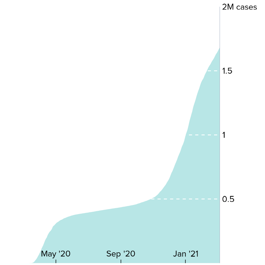
casesFL <- COVID_NY_FL_tracking[COVID_NY_FL_tracking$state == "florida", ]
casesFLpoly <- rbind(
    casesFL,
    data.frame(
        "date" = as.Date("2021-03-07"),
        "state" = "florida",
        "caseIncrease" = -1 * sum(casesFL$caseIncrease)
    )
)

cases_FLline <- ggplot(
    casesFL,
    aes(x = date, y = cumsum(caseIncrease))
) +
    geom_polygon(data = casesFLpoly, fill = "#B8E6E6") +
    scale_x_date(
        labels = date_format("%b '%y"),
        breaks = as.Date(c("2020-05-01", "2020-09-01", "2021-01-01")),
        limits = as.Date(c("2020-01-29", "2021-03-07")),
        expand = c(0, 0)
    ) +
    scale_y_continuous(labels = ylabels, position = "right", expand = c(0, 0)) +
    geom_hline(
        yintercept = c(500000, 1000000, 1500000, 2000000),
        color = "white", linetype = "dashed", size = 0.3
    ) +
    coord_cartesian(ylim = c(0, 2000000)) +
    theme(
        panel.background = element_rect(fill = "transparent", color = NA),
        plot.background = element_rect(fill = "transparent", color = NA),
        text = element_text(family = "ProximaNova"),
        panel.grid = element_blank(),
        panel.border = element_blank(),
        axis.line.x.bottom = element_blank(),
        axis.line.y = element_line(size = 0.1, color = "#8F9BB3"),
        axis.title = element_blank(),
        axis.text.y = element_text(size = 7, color = "black"),
        axis.text.x = element_text(
            size = 7, hjust = 0.5,
            margin = margin(t = -10), color = "black"
        ),
        axis.ticks = element_line(color = "black", size = 0.2),
        axis.ticks.y = element_blank(),
        axis.ticks.length.x.bottom = unit(-0.1, "cm"),
        plot.title = element_text(size = 8, hjust = 1),
        plot.title.position = "plot"
    )

print(cases_FLline)
- Pie charts of COVID-19 vaccination status:
data("COVID_NY_FL_vaccines")

vaccines_NYpie <- ggplot(
    COVID_NY_FL_vaccines[COVID_NY_FL_vaccines$state == "new york", ],
    aes(x = "", y = value, fill = vax_group)
) +
    geom_bar(width = 1, stat = "identity") +
    theme_void() +
    scale_fill_manual(values = c("#FBAA7E", "#F7EEBF", "#FBCB88")) +
    coord_polar(theta = "y", start = 2.125, clip = "off") +
    geom_text(aes(
        x = c(1.9, 2, 1.9),
        y = c(1.65e7, 1.3e6, 7.8e6),
        label = paste0(percent, "%")
    ),
    size = 2.25, color = "black"
    ) +
    theme(
        legend.position = "none",
        plot.title = element_text(
            hjust = 0.5, vjust = -3.5, size = 10,
            family = "ProximaNova", face = "bold"
        ),
        text = element_text(family = "ProximaNova")
    ) +
    labs(title = "New York")

print(vaccines_NYpie)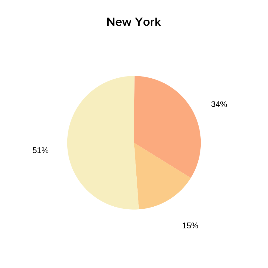
vaccines_FLpie <- ggplot(
    COVID_NY_FL_vaccines[COVID_NY_FL_vaccines$state == "florida", ],
    aes(x = "", y = value, fill = vax_group)
) +
    geom_bar(width = 1, stat = "identity") +
    scale_fill_manual(values = c("#FBAA7E", "#F7EEBF", "#FBCB88")) +
    theme_void() +
    coord_polar(theta = "y", start = pi / 1.78, clip = "off") +
    geom_text(aes(
        x = c(1.95, 2, 1.9),
        y = c(1.9e7, 1.83e6, 9.6e6),
        label = paste0(percent, "%")
    ),
    color = "black",
    size = 2.25
    ) +
    theme(
        legend.position = "none",
        plot.title = element_text(
            hjust = 0.5, vjust = -4, size = 10,
            family = "ProximaNova", face = "bold"
        ),
        text = element_text(family = "ProximaNova")
    ) +
    labs(title = "Florida")

print(vaccines_FLpie)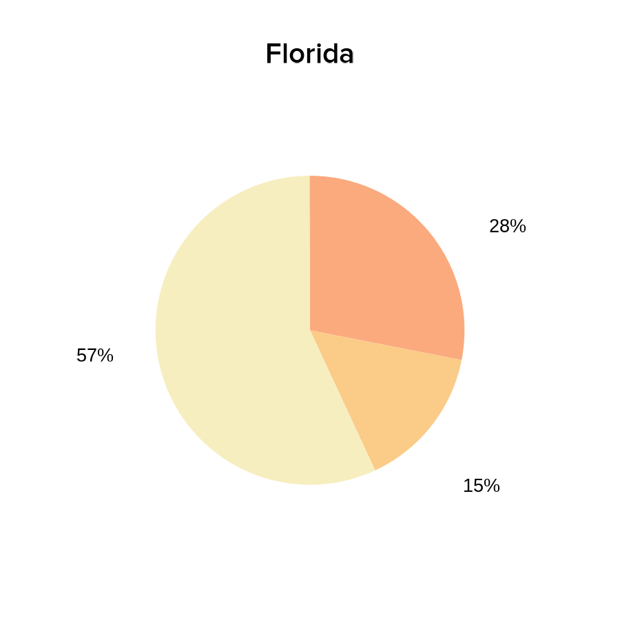
We can now easily overlap and size all these ggplots by
passing our saved plot objects into plotGG():
pageCreate(width = 9.5, height = 3.5, default.units = "inches")

plotGG(
    plot = US_map,
    x = 0.1, y = 0,
    width = 6.5, height = 3.5, just = c("left", "top")
)
plotGG(
    plot = cases_NYline,
    x = 6.25, y = 1.8,
    width = 3.025, height = 1.4, just = c("left", "bottom")
)
plotGG(
    plot = cases_FLline,
    x = 6.25, y = 3.5,
    width = 3.025, height = 1.4, just = c("left", "bottom")
)
In particular, plotgardener makes it easy to resize and
place our pie charts in a layout that overlaps our line plots without it
affecting the sizing of the other plots on the page:
plotGG(
    plot = vaccines_NYpie,
    x = 6.37, y = -0.05,
    width = 1.45, height = 1.45, just = c("left", "top")
)
plotGG(
    plot = vaccines_FLpie,
    x = 6.37, y = 1.67,
    width = 1.45, height = 1.45, just = c("left", "top")
)
We can also easily add additional elements to further enhance our
complex ggplot arrangments, like a precise placement of
text labels:
plotText(
    label = c("not", "partially", "fully vaccinated"),
    fontfamily = "ProximaNova", fontcolor = "black", fontsize = 7,
    x = c(6.58, 7.3, 7.435),
    y = c(0.74, 1.12, 0.51), just = c("left", "bottom")
)
plotText(
    label = c("not", "partially", "fully vaccinated"),
    fontfamily = "ProximaNova", fontcolor = "black", fontsize = 7,
    x = c(6.58, 7.39, 7.435),
    y = c(2.47, 2.75, 2.2), just = c("left", "bottom")
)
plotText(label = paste("Sources: The COVID Tracking Project;",
                        "Johns Hopkins Center for Civic Impact"),
            fontfamily = "ProximaNova", fontcolor = "black",
            fontsize = 7, fontface = "italic",
            x = 0.15, y = 3.45, just = c("left", "bottom"))
We are then left with a complex, precise, and elegant arrangement of
ggplots as if we had arranged them together with graphic
design software:
ComplexHeatmap
Heatmaps are an integral visualization to many multi-panel genomic
visualizations. Existing Bioconductor packages like
ComplexHeatmap provide excellent methods to produce such
heatmaps. Since these plots are also based on grid
graphics, it is possible to incorporate them into
plotgardener figure arrangements.
For example, let’s say we made a heatmap representing the density of ChIP-seq data at a particular peak:
library(ComplexHeatmap)
library(purrr)
library(RColorBrewer)

# Simulated data
genmat <- map(
    1:2000,
    function(i) {
        c(sort(abs(rnorm(50)))[1:25], rev(sort(abs(rnorm(50)))[1:25])) * i/5000
    }
) %>% do.call(rbind, .)
genmat <- genmat[nrow(genmat):1,]
Heatmap(genmat, col = colorRampPalette(brewer.pal(n = 9, "YlGnBu"))(9),
        border = "black",
        border_gp = gpar(lwd = 0.5),
        show_heatmap_legend = FALSE,
        cluster_rows = FALSE, cluster_columns = FALSE)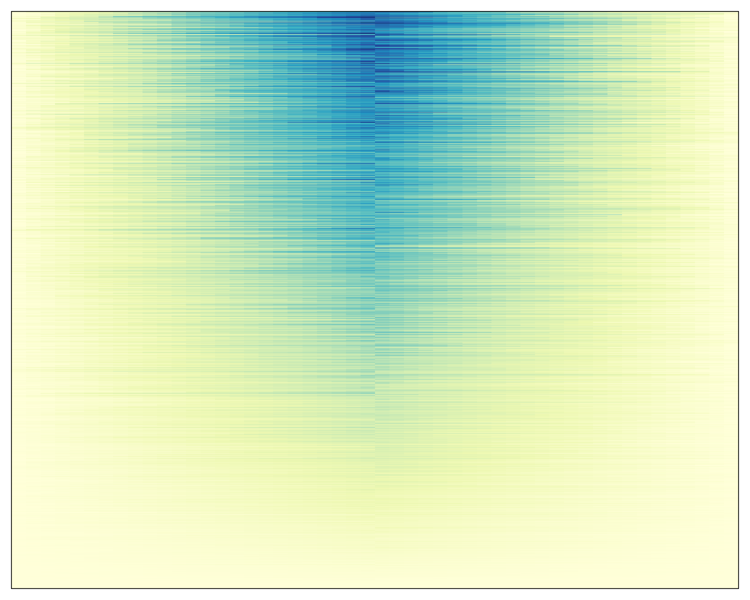
We can capture this heatmap with the grid function
grid.grabExpr():
library(grid)
heatmap <- grid.grabExpr(draw(Heatmap(genmat,
                    col = colorRampPalette(brewer.pal(n = 9, "YlGnBu"))(9),
                    border = "black",
                    border_gp = gpar(lwd = 0.5),
                    show_heatmap_legend = FALSE,
                    cluster_rows = FALSE, cluster_columns = FALSE)))
We can now pass this object into the plotGG function and
incorporate the heatmap into a plotgardener layout with
additional figure elements made by plotgardener:
data("GM12878_HiC_10kb")
data("GM12878_ChIP_CTCF_signal")
data("GM12878_ChIP_H3K27ac_signal")
library("org.Hs.eg.db")
library("TxDb.Hsapiens.UCSC.hg19.knownGene")

## Create page
pageCreate(
    width = 6, height = 4, default.units = "inches")

params <- pgParams(chrom = "chr21", chromstart = 28150000, chromend = 29150000,
                   assembly = "hg19",
                   x = 0.5, width = 2, default.units = "inches")
ctcf_range <- pgParams(range = c(0, 77),
                       assembly = "hg19")
hk_range <- pgParams(range = c(0, 32.6),
                     assembly = "hg19")
hic_gm <- plotHicTriangle(data = GM12878_HiC_10kb, params = params,
                          zrange = c(0, 200), resolution = 10000,
                          y = 1.5, height = 1.25, just = c("left", "bottom"))
annoHeatmapLegend(plot = hic_gm, fontsize = 7,
                  x = 2.5, y = 0.5, width = 0.07, height = 0.5,
                  just = c("right", "top"), default.units = "inches")
ctcf_gm <- plotSignal(data = GM12878_ChIP_CTCF_signal, params = c(params, ctcf_range),
                      fill = "#253494", linecolor = "#253494",
                      y = 1.6, height = 0.6)
plotText(label = "CTCF", fontcolor = "#253494", fontsize = 8,
         x = 0.5, y = 1.6, just = c("left","top"), default.units = "inches")
hk_gm <- plotSignal(data = GM12878_ChIP_H3K27ac_signal, params = c(params, hk_range),
                    fill = "#37a7db", linecolor = "#37a7db",
                    y = 2.3, height = 0.6, just = c("left", "top"))
plotText(label = "H3K27ac", fontcolor = "#37a7db", fontsize = 8,
         x = 0.5, y = 2.4, just = c("left","bottom"), default.units = "inches")
genes_gm <- plotGenes(params = params, stroke = 1, fontsize = 6,
                      strandLabels = FALSE,
                      y = 3, height = 0.4)
annoGenomeLabel(plot = genes_gm, params = params,
                scale = "Kb", fontsize = 7,
                y = 3.5, digits = 0)

## Add ComplexHeatmap
gg_heatmap <- plotGG(
    plot = heatmap,
    x = 3, y = 0.5,
    width = 2.5, height = 3
)
seekViewport(name = "heatmap_matrix_2")
grid.xaxis(at = c(0, 0.5, 1), label = FALSE, gp = gpar(lwd = 0.5))
seekViewport(name = "page")

plotText(label = "Simulated Data", x = 4.25, y = 0.5,
         fontsize = 12, just = "bottom")
plotText(label = c(-2, 0, 2), x = c(3.065, 4.255, 5.425),
         y = 3.6, fontsize = 7)
plotText(label = "Distance from center", x = 4.25,
         y = 3.75, fontsize = 8)

## Hide page guides
pageGuideHide()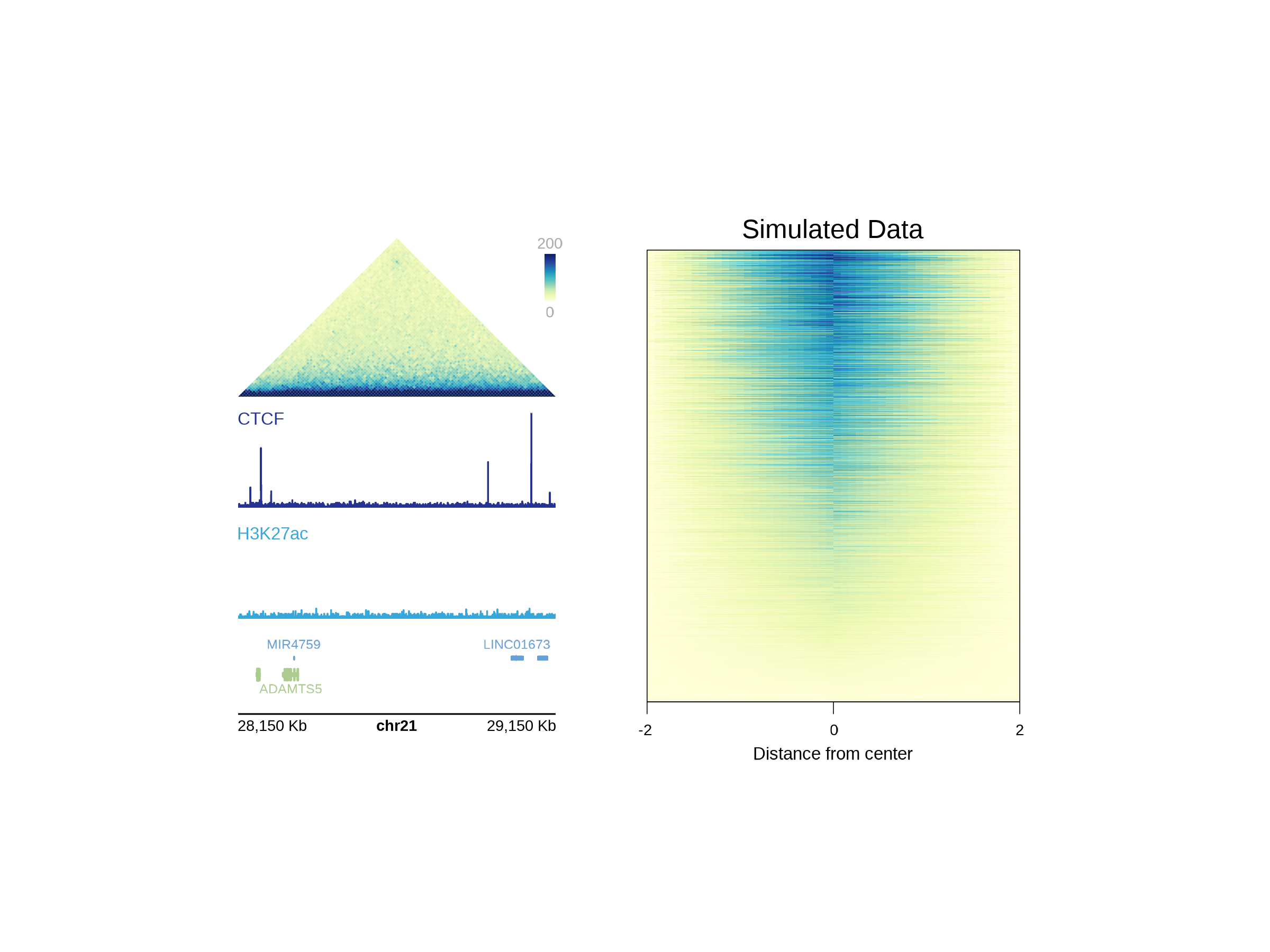
Session Info
sessionInfo()
#> R version 4.4.0 (2024-04-24)
#> Platform: x86_64-pc-linux-gnu
#> Running under: Red Hat Enterprise Linux 9.7 (Plow)
#>
#> Matrix products: default
#> BLAS/LAPACK: /nas/longleaf/rhel9/apps/r/4.4.0/lib/libopenblas_haswellp-r0.3.27.so;  LAPACK version 3.12.0
#>
#> locale:
#>  [1] LC_CTYPE=en_US.UTF-8       LC_NUMERIC=C
#>  [3] LC_TIME=en_US.UTF-8        LC_COLLATE=en_US.UTF-8
#>  [5] LC_MONETARY=en_US.UTF-8    LC_MESSAGES=en_US.UTF-8
#>  [7] LC_PAPER=en_US.UTF-8       LC_NAME=C
#>  [9] LC_ADDRESS=C               LC_TELEPHONE=C
#> [11] LC_MEASUREMENT=en_US.UTF-8 LC_IDENTIFICATION=C
#>
#> time zone: America/New_York
#> tzcode source: system (glibc)
#>
#> attached base packages:
#> [1] stats4    grid      stats     graphics  grDevices utils     datasets
#> [8] methods   base
#>
#> other attached packages:
#>  [1] TxDb.Hsapiens.UCSC.hg19.knownGene_3.2.2
#>  [2] GenomicFeatures_1.58.0
#>  [3] GenomicRanges_1.58.0
#>  [4] GenomeInfoDb_1.42.3
#>  [5] org.Hs.eg.db_3.20.0
#>  [6] AnnotationDbi_1.68.0
#>  [7] IRanges_2.40.1
#>  [8] S4Vectors_0.44.0
#>  [9] Biobase_2.66.0
#> [10] BiocGenerics_0.52.0
#> [11] RColorBrewer_1.1-3
#> [12] purrr_1.0.4
#> [13] ComplexHeatmap_2.22.0
#> [14] scales_1.4.0
#> [15] ggplot2_3.5.2
#> [16] showtext_0.9-8
#> [17] showtextdb_3.0
#> [18] sysfonts_0.8.9
#> [19] plotgardenerData_1.12.0
#> [20] plotgardener_1.15.1
#>
#> loaded via a namespace (and not attached):
#>   [1] DBI_1.2.3                   bitops_1.0-9
#>   [3] rlang_1.1.6                 magrittr_2.0.3
#>   [5] clue_0.3-66                 GetoptLong_1.0.5
#>   [7] RSQLite_2.3.11              matrixStats_1.5.0
#>   [9] compiler_4.4.0              png_0.1-8
#>  [11] systemfonts_1.2.3           vctrs_0.6.5
#>  [13] pkgconfig_2.0.3             shape_1.4.6.1
#>  [15] crayon_1.5.3                fastmap_1.2.0
#>  [17] magick_2.9.1                XVector_0.46.0
#>  [19] labeling_0.4.3              Rsamtools_2.22.0
#>  [21] rmarkdown_2.29              UCSC.utils_1.2.0
#>  [23] strawr_0.0.92               ragg_1.4.0
#>  [25] bit_4.6.0                   xfun_0.52
#>  [27] zlibbioc_1.52.0             cachem_1.1.0
#>  [29] jsonlite_2.0.0              blob_1.2.4
#>  [31] rhdf5filters_1.18.1         DelayedArray_0.32.0
#>  [33] Rhdf5lib_1.28.0             BiocParallel_1.40.2
#>  [35] parallel_4.4.0              cluster_2.1.8.1
#>  [37] R6_2.6.1                    plyranges_1.26.0
#>  [39] bslib_0.9.0                 rtracklayer_1.66.0
#>  [41] jquerylib_0.1.4             Rcpp_1.1.1-1.1
#>  [43] SummarizedExperiment_1.36.0 iterators_1.0.14
#>  [45] knitr_1.50                  Matrix_1.7-3
#>  [47] tidyselect_1.2.1            rstudioapi_0.17.1
#>  [49] dichromat_2.0-0.1           abind_1.4-8
#>  [51] yaml_2.3.10                 doParallel_1.0.17
#>  [53] codetools_0.2-20            curl_6.2.3
#>  [55] lattice_0.22-7              tibble_3.2.1
#>  [57] KEGGREST_1.46.0             withr_3.0.2
#>  [59] evaluate_1.0.3              gridGraphics_0.5-1
#>  [61] desc_1.4.3                  circlize_0.4.16
#>  [63] Biostrings_2.74.1           pillar_1.10.2
#>  [65] MatrixGenerics_1.18.1       foreach_1.5.2
#>  [67] generics_0.1.4              RCurl_1.98-1.17
#>  [69] glue_1.8.0                  tools_4.4.0
#>  [71] BiocIO_1.16.0               data.table_1.17.4
#>  [73] GenomicAlignments_1.42.0    fs_1.6.6
#>  [75] XML_3.99-0.18               rhdf5_2.50.2
#>  [77] Cairo_1.6-2                 colorspace_2.1-1
#>  [79] GenomeInfoDbData_1.2.13     restfulr_0.0.15
#>  [81] cli_3.6.5                   rappdirs_0.3.3
#>  [83] textshaping_1.0.1           S4Arrays_1.6.0
#>  [85] dplyr_1.1.4                 gtable_0.3.6
#>  [87] yulab.utils_0.2.4           sass_0.4.10
#>  [89] digest_0.6.37               SparseArray_1.6.2
#>  [91] ggplotify_0.1.2             rjson_0.2.23
#>  [93] htmlwidgets_1.6.4           farver_2.1.2
#>  [95] memoise_2.0.1               htmltools_0.5.8.1
#>  [97] pkgdown_2.1.3               lifecycle_1.0.4
#>  [99] httr_1.4.7                  GlobalOptions_0.1.2
#> [101] bit64_4.6.0-1